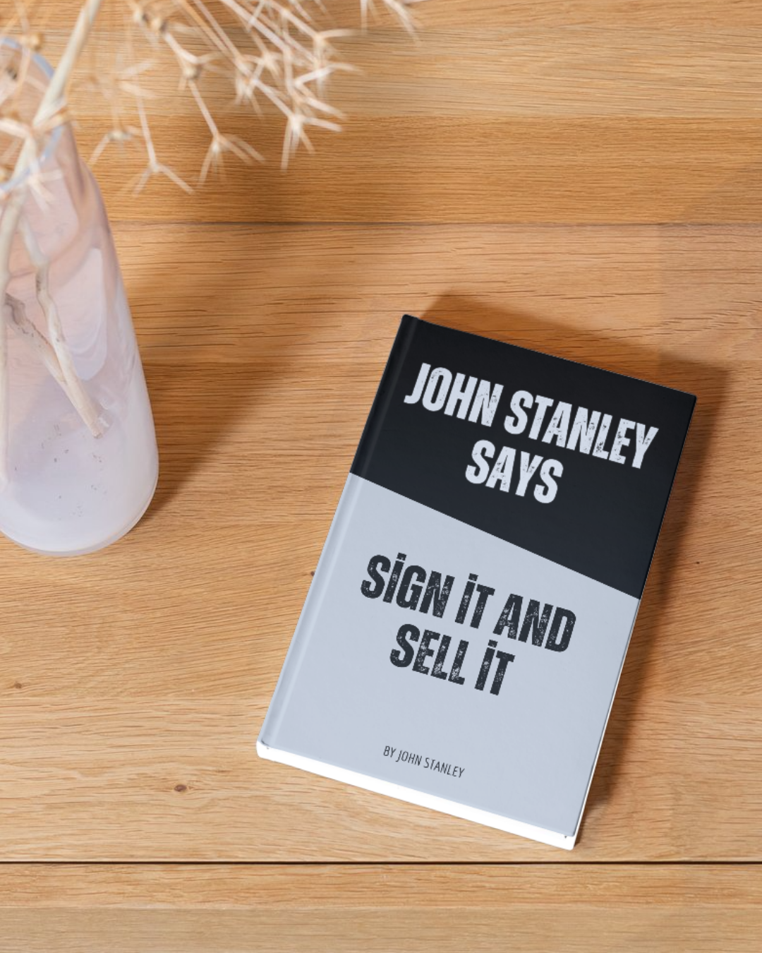
Signage is one of the most valuable marketing tools developed for retailers.
I realise many people say they do not read signs, but, I do not agree. I think we all read signs, but only the signs that we want to read.
You need a signage strategy that makes you stand out from the crowd and get noticed. As I write this ebook, I am looking out onto a small village square in Czech. There are signs in both English and Czech and I have counted over 50 signs. That is from one location. You can understand why we do not read signs; we are exposed to thousands every day of our lives. One sign stands out when I look out of my window. It is in a bike shop window next to a dirty bike, the sign read “Dirty is the New Black.” It is different, it is amusing and it is clever. Out of all the signs, this is the one I read and remembered. Your signs need to be just as effective.
With the onset of social media marketing we often forget how important signage can be in making a sale, we need to have as much focus on signage as we do Facebook or Twitter.
Make Signs Readable
The style of the sign depends on where and how it is going to be read, consider the following points:
- Is the sign going to be read as the reader walks past or drives past the sign? What speed will they be travelling at when they are supposed to read the sign? This will affect the size of the lettering, the amount of words you can use, the colour combinations and style of printing. For example if the sign is to be read at 15 m away from the sign, the letters need to be a minimum of 4.5cm tall and at 50 km an hour the reader can only read 4 words
- What is the message you want to get across? Is it a basic information sign, e.g. opening hours or are you trying to inspire the consumer?
- If your aim is to inspire than use inspirational words that will attract the attention of the consumer.
- Research shows that the following words are what are called “Action Words” when it comes to buying:
At Last, Attention, Back by Popular Demand, Check out these, Exclusive, Finally, For the First Time, Good News, Huge Savings, Hurry, In a Class by Itself, It’s here, New, New Low Price, Only, Quality does not have to cost you, Reasons why you should, Save Big, State of the Art, Switch to, Take a look at, Take the challenge, The Smart Choice, Urgent.
Reread the above list you will notice I have only used the word price – once. We tend to overdo that one word in most marketing.
Change signs based on Product Life Cycle
We are all aware that a product has a life cycle. A new product is launched and the “explorers” are the first adapters of the product, then hopefully sales increase as the new item gets established. Then we get a peak in sales before we see early decline and eventually a clearance of the product.
The signage we use should relate to this selling pattern.
Explores want to see the word “NEW” on a sign or “It’s Here.” Once we get to the sales increase stage we need to change the word and “Attention” may be used. At the peak of the sales we may use the words “Take a Look at These” and change these words to “Check These out” as the early decline starts. When we get to the clearance stage, the wording on the sign may include “Huge Savings.”
The Art of Writing a Sign
Is writing a sign an art or a science, I am not sure. I do know there has been a lot of research carried out into how to write a sign and it puzzles me why a lot of retailers do not keep to the rules that have been proved to work. I would delegate one person to write and manage the signs so that you create some accountability.
The Rules they should abide by are as follows:
- People read lower case more easily than upper case, so use CAPITALS very sparingly.
- Use colour combinations that can be read easily. Do not try to be clever with colour combinations, make sure the background colour makes the words stand out.
- Use a typeface that is easy for the consumer to read. The easiest one is “Serif”
- If it is a common Known Value product, such as milk, the consumer just wants to know the price.
- If it is a Non Know Value product, such as celeriac, the consumer needs to know:
– What it is
– Three benefits of the product – NOT features
– The Price - Keep it simple and it will work
Give the Customer Variety
It would be easy to sign every product you sell, except then the store would confuse the consumer. You need to select what promotional signage you are going to use and then rotate the products that you sign. This will create new interest every time the consumer walks into your store.
Signage does increase sales, but, alas many retailers do not get it right. A well implemented signage strategy should be the equivalent of having one more person on the shop floor selling product. Signs reflect your image as a business and help the consumer to start to engage with the team in a conversation.
If you have not developed a strategy for your signage then now is the time to start as it will help you grow sales and provide the consumer with a silent salesperson that will build their confidence to make a purchase.

